Development Journal - BORDERLANDS Trilogy

The majority of my time at Gearbox was focused on this original IP, starting back at the end of 2007 and concluding ten years later. As is the case with most projects, there is an evolution of the design language and ideas. In the case of the original Borderlands game, the studio changed the visual style drastically from the original concept nine months prior to release. The subsequent games polished and refined the visual aesthetic as our tools advanced and talented artists came on board.
[main project page]BORDERLANDS
My time was split between developing the updated look for the first game and working on Aliens: Colonial Marines. There was some exploration, but due to time, the production of the game went along pretty quickly.
CLAPTRAP - I worked on the Borderlands franchise as a senior conceptual designer. My “feather in the cap” contribution was creating the player’s muse, Claptrap. The initial design was a quick sketch that I called “zippy” which was literally a throwaway design. Art Director Brian Martel loved the look and immediately added him to the revamp of the game. He and I acted out the behaviors of the character before the writer, animators, and voice actor were brought on board to bring him to life. The final version, of course, was a collaboration consisting of myself and a small team of artists.
Another surprise was to see his cameo in Ready Player One. A true-to-the-game version was also revealed in the trailer for the live-action film. I stayed with him through the development of the third game where he needed some extra ware and tare.
VISUAL STYLE - I was one of many who helped develop the signature style that the games would be known for. Every detail was designed and developed for every prop, from yurt interiors to the types of cracks defining the rocks (I was responsible for the “mass-cracking” of the first game). In addition, there were several ideas for levels and environments that were considered but disregarded.
BORDERLANDS 2, DLCs & PRE-SEQUEL
Due to the success of the first game the follow-up was to try and outperform in every respect the first. I think we were successful in this regard.
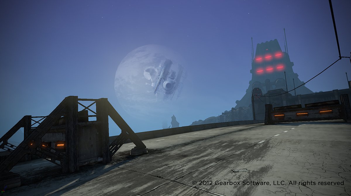
HYPERION MOONBASE - We fleshed out the world of Pandora beyond what we were capable of doing in the original. The corporation that dominated the planet, Hyperion, created an omnipresent satellite-moon that orbited the planet in front of the moon/sun/celestial body. This would be our death star (figuratively and literally as it would shoot stuff from orbit). This design carried over in the “pre-sequel” game that was primarily developed by an external studio and featured gameplay within the station.
DESIGN / FORM LANGUAGE - We inadvertently created a distinct form and design language with the introduction of Claptrap in the first game. The writer and art directors of the sequel decided to establish competing manufacturers that created the weaponry, among other things, in the game universe. Each had to have a strong identity that was recognizable.
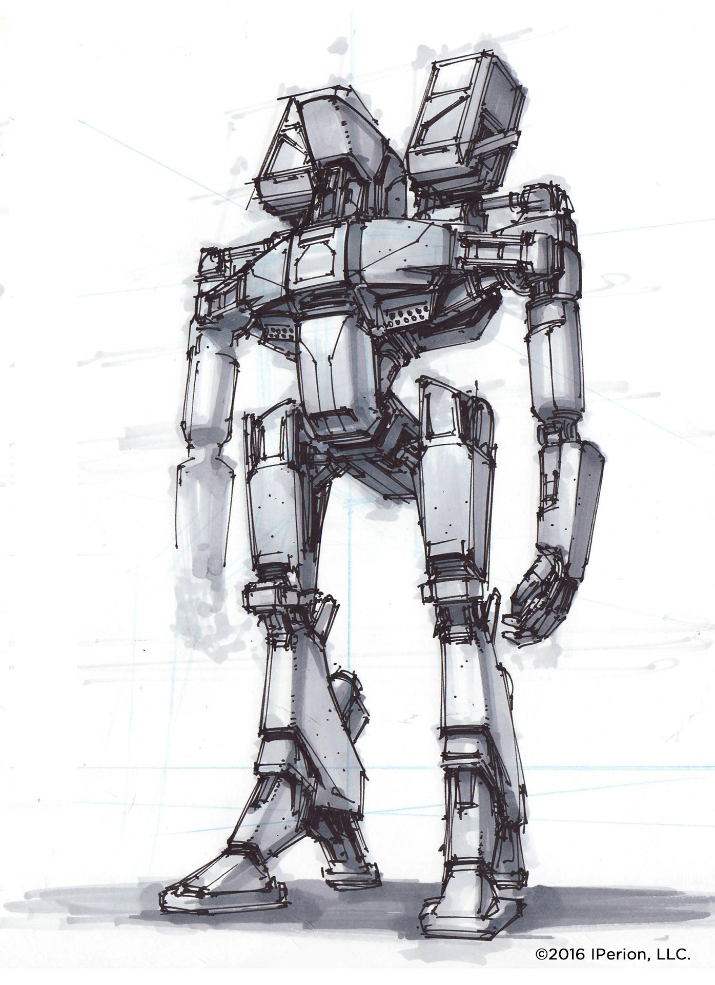
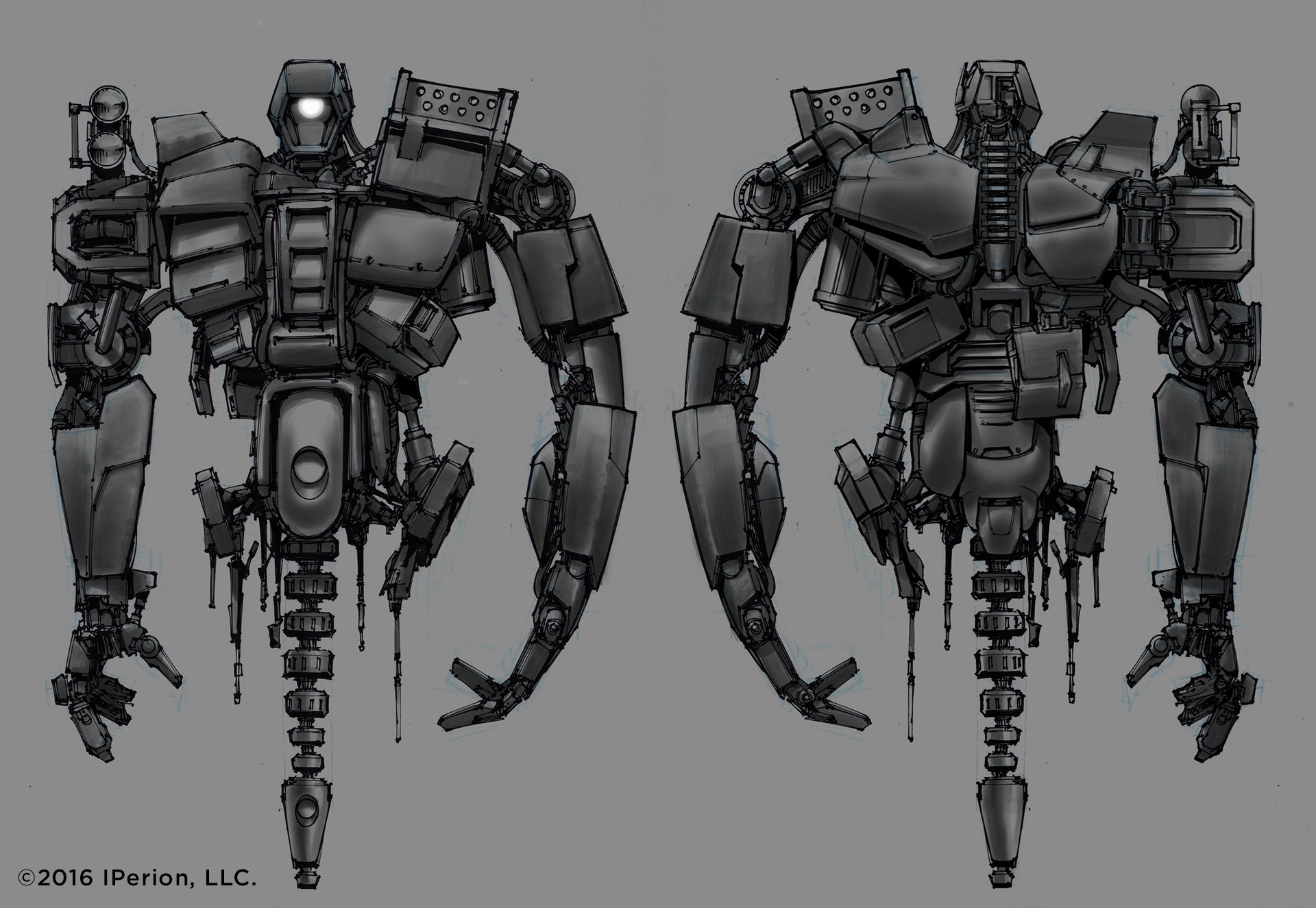
HYPERION BATTLE DROIDS - The art director gave me carte blanche to come up with the “cannon fodder” robots that the Hyperion Corp created to fight the players. As a life-long aficionado of robots (literally since I was a child), this was heaven. These were to be akin to the battle droids from Star Wars Episode 1.
Design inspiration came from a variety of influences from my formative years: Transformers, Robotech, Terminator, Robocop. Part of the process also involved cutting together some footage, and specific audio, from a variety of film scenes that would inspire the animation and audio artists to reference.
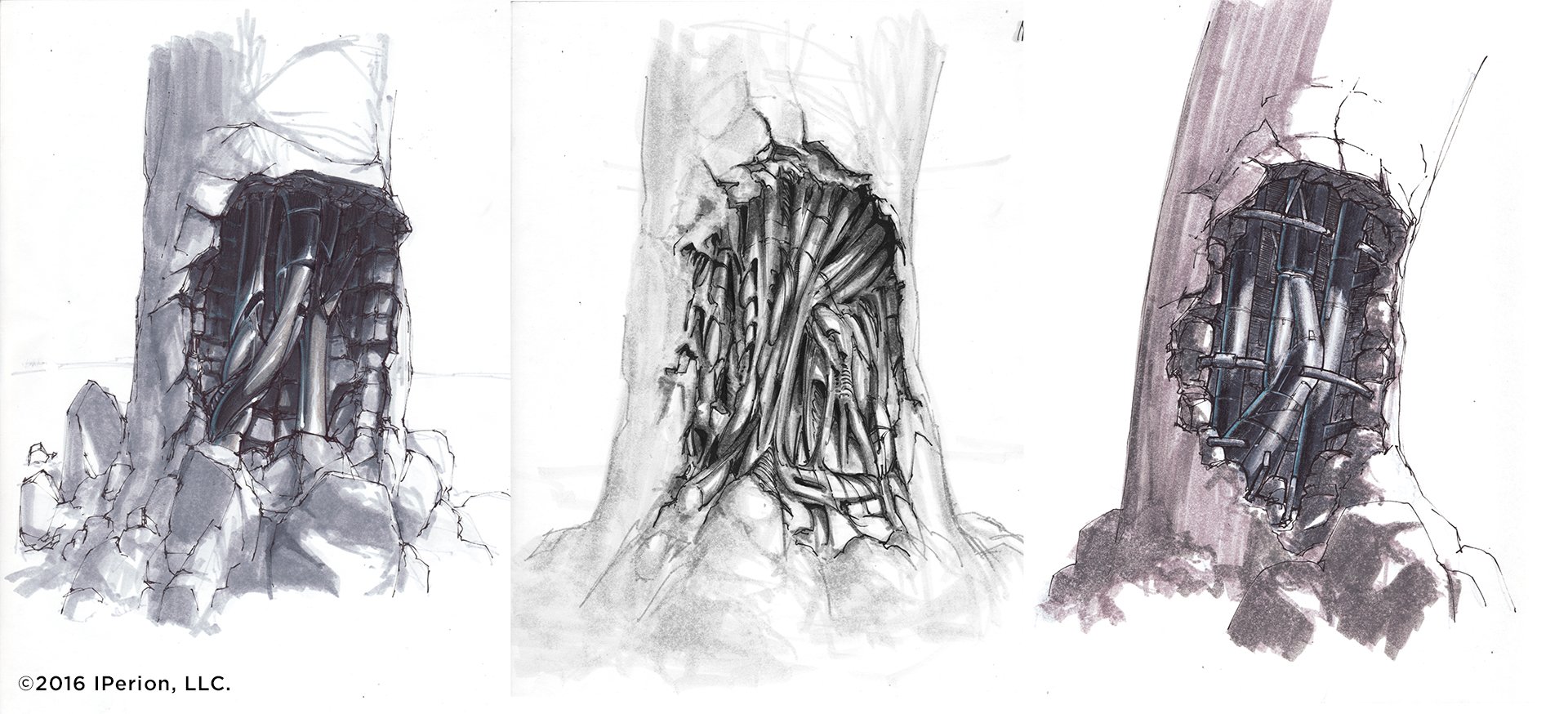
SANCTUARY - One of the main locations was a small town that ends up flying…because why not? As a designer, I’ve always found it beneficial to have at least a brief story to give a concept some sort of logic. I developed a micro-narrative to assist in the design of Sanctuary. Incidentally, this scenario stuck and became cannon.
One of the game universes’ weapons manufacturers sent these giant mobile mining facilities all over the galaxy to harvest raw materials. This unit was abandoned for an unknown reason, and the elements buried it over time. Societies then came and built up a small city on top of the machine, unbeknownst to them what lies beneath.
VEHICLES
Hovertrain:The first round of designs was literally going to be sci-fi western locomotives. My main point of reference was the classic hover train from the last Back to the Future film, but the art director and I decided we wanted to pull in former Eastern Bloc diesel locomotives; giant muscular trains, would be a nice compliment to the loose “western” theme of the game. We also wanted to go beyond a simple “hovering” vehicle, so we also decided to create an articulating arm that would permit dynamic movement over any landscape and create added visceral interest.
Bandit Gyro-copter: The gyro-copter was tackled by the talented Danny Gardner who created the initial base and I added my two cents prior to final modeling.
DOWNLOADABLE CONTENT (DLCs) - In addition to the main game, added content was created for side missions. The genre diverted away from the base sci-fi/western theme of the main platform into fantasy and horror as well. It was a fun chance to add some new flavors to the game.
One character, Deathtrap, was an added ability to one of the characters, who could “summon” junk to form a giant golem-like robot to take out enemies. Other DLCs ventured into pirate and fantasy territories.
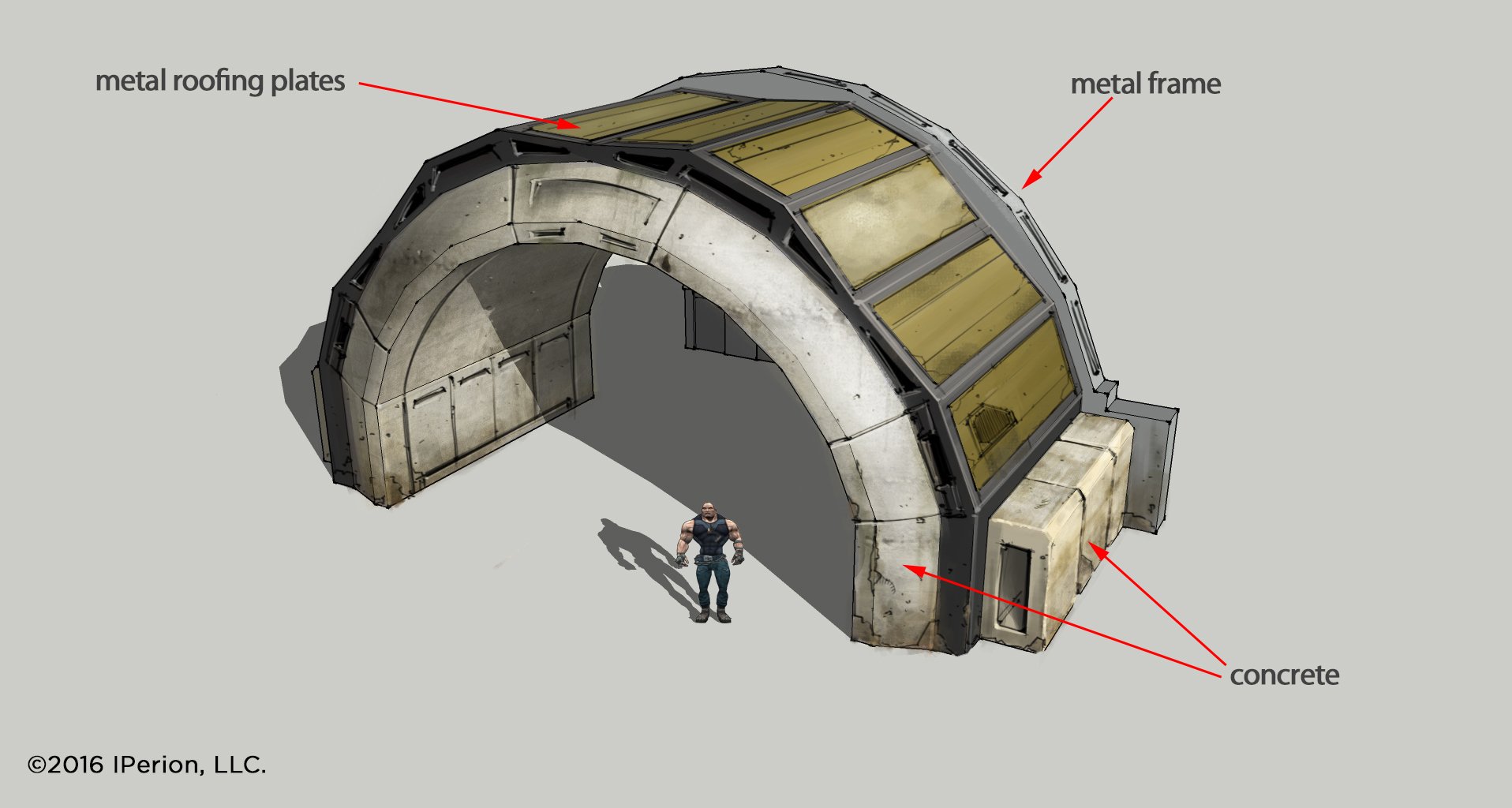
ENVIRONMENTS - Not all designs are glamorous. Most of the work is purely functional to meet the needs of the level designers who have to populate a level with interesting obstacles and props.
BORDERLANDS 3
My final excursion in the Borderlands universe before leaving Gearbox. Ultimately, many of the final designs would change as decisions were altered over the course of production. Such is the life of a concept designer.
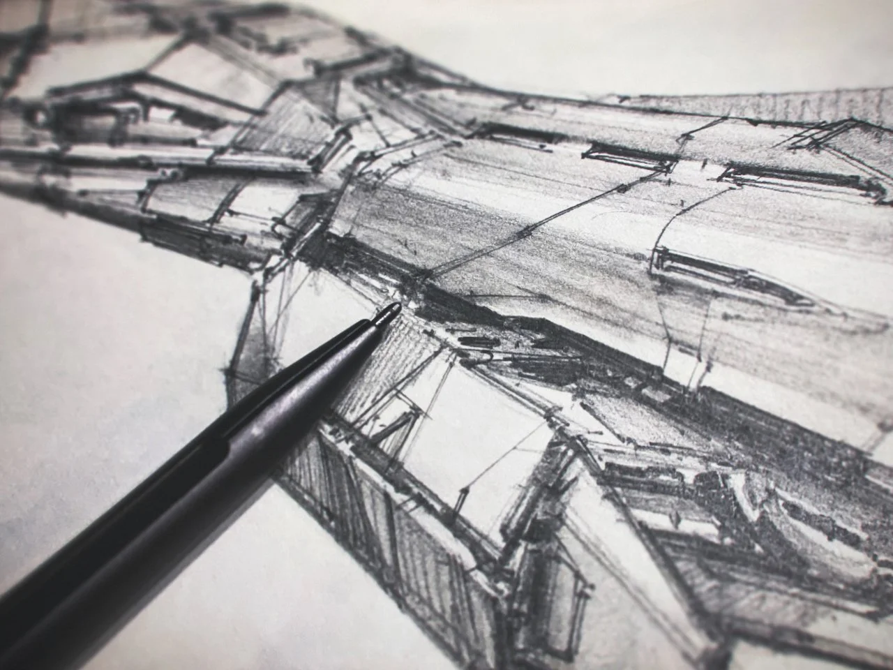
SANCTUARY 3 - I took a stab at the space-faring hub. A massive ship where multiplayer activities could take place while traveling to different planets. This was the game’s Millennium Falcon/Firefly. I was pushing for this player hub to be reminiscent of a Dodge Charger muscle car crossed with an XB-70. While flying in the atmosphere the rear engines would spread out to the current position, and upon launch and deep space flight they would fold under in a more aggressive configuration.
ENVIRONMENTS - I also was afforded an opportunity to explore some new environments for the game, a rare treat since I am usually regulated to singular designs. The main world I helped to develop was Promethea: a war-ravaged city-planet. These are some granular explorations from the ground level.
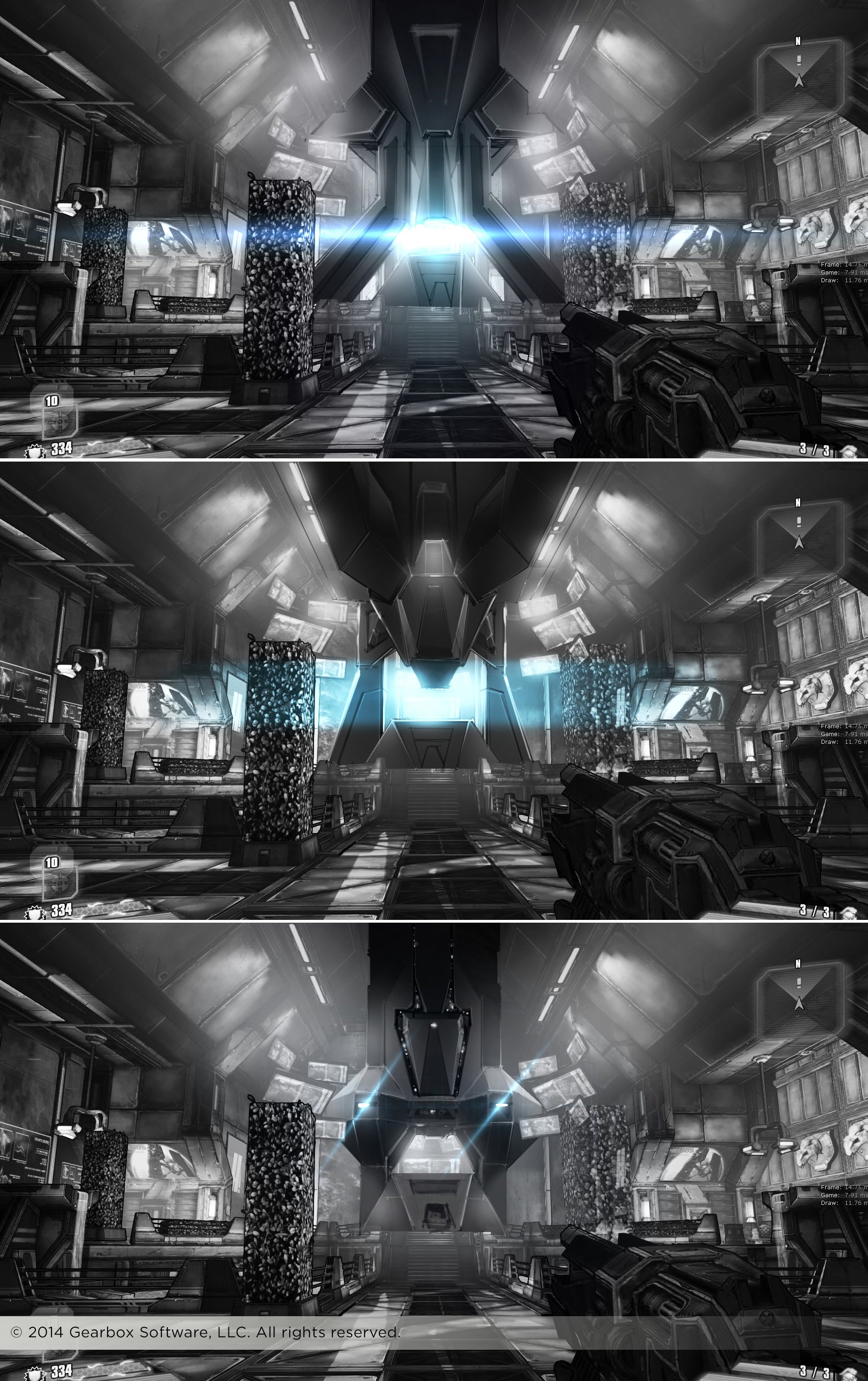
FLYING FACTORIES - One of the manufacturers in this game was going to have massive flying factory ships that would drop their automatic robotic soldiers into the warzone to attack the players.
PROPS & ROBOTS - As always, utility rears its head once the hero assets and designs are in production. As in previous games, we have a “magical” deus ex machina device that constructs whatever the player needs, and a variety of service robots that both attack the players and fulfill mundane civic needs.

